Redefining Navigation for a Scalable SaaS Platform
Led the structural overhaul of Qive (former Arquivei)'s navigation — from design-led initiative through stakeholder alignment, usability validation, and progressive rollout.
Qive (former Arquivei) is Brazil's largest fiscal document automation and management SaaS platform — serving over 100,000 SMB and Enterprise companies and processing 30% of all B2B fiscal documents in the country.
As the platform expanded, the navigation evolved without a consistent structure. New modules were added independently by different teams, causing the experience to reflect the company's internal organization rather than the user's workflow.
By the time this initiative started
Users struggled to locate features they already knew existed
New users had difficulty discovering product value
Navigation depth increased as new products were added
Information architecture became increasingly fragile and difficult to scale
This was a design-led initiative. I identified the problem, framed the business case, and aligned product and engineering stakeholders around the need for structural change.
Because the redesign would affect every product entry point, we validated the proposal through usability testing before development started. The initiative later became part of the company's 2024 structural roadmap.
Key insight
The navigation reflected the company structure, not the user workflow
Product growth was increasing structural complexity
Scalability required a sustainable categorization model, not isolated UI fixes
Problem
The navigation issues were not visual — they were structural.
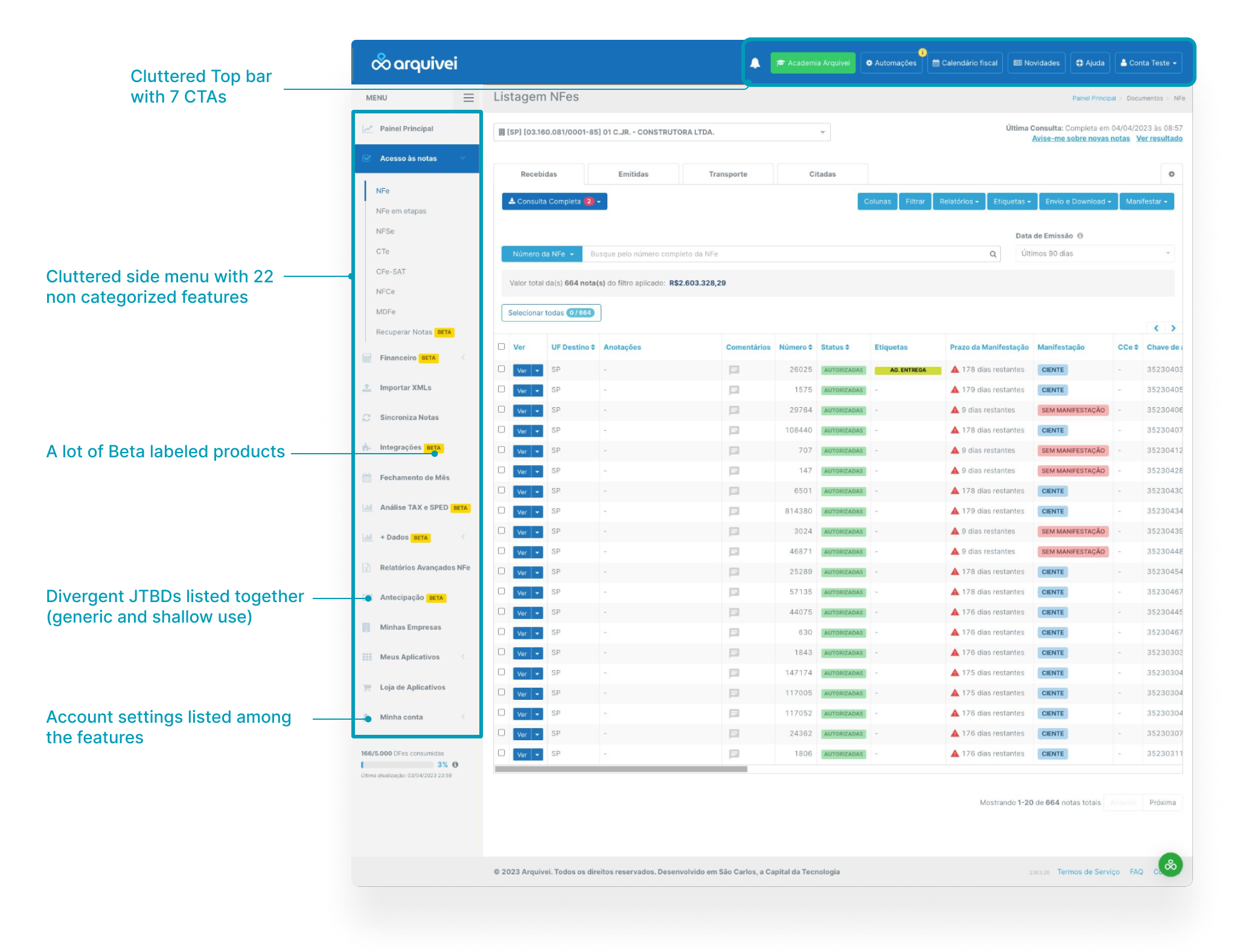
Users had to know what a feature was called to find it, instead of navigating based on what they were trying to accomplish.
The original navigation structure — organized around internal product teams, not user workflows
Two main problems
Existing users spent unnecessary time locating features
New users failed to discover valuable functionality
For the business, every new feature added additional complexity to an already fragile system.
Goal
Design a navigation system organized around how users think about their work — while creating a scalable structure capable of supporting future product expansion.
Improved feature findability
Reduced navigation friction in key workflows
Scalable information architecture for future products
Approach
Before proposing a new structure, we mapped the existing navigation patterns across the platform and analyzed how users interacted with the product in their daily workflows.
The central tension we had to resolve: documents are the foundation of every user flow, regardless of persona — but the tools that add intelligence to those documents are tied to specific operational routines. That distinction drove the structural question.
What we analyzed
Navigation depth and feature discoverability across personas
Which features were shared across all users vs. specific to a department
Most repeated actions and most accessed flows per user type
Label clarity and interaction consistency across modules
Key insight
Not all features belong to the same organizational logic — document access is universal, intelligence tools are contextual
Frequency of use wasn't a categorization model — it was a prioritization rule applied within any structure to surface the most-used features first
The Decision
The mapping revealed that the product had two distinct types of content that needed different organizational logic.
Universal layer
Documents — a shared, generic tab
Document consultation and simple reports sit in a main tab accessible to all personas. Documents are the starting point of every user flow, regardless of role — so they needed a neutral, shared space.
Contextual layer
Intelligence tools — organized by department
Automations, reconciliations, validations, and other tools that add intelligence to documents are organized by operational department — Purchasing, Fiscal, Finance. These features complement the routine of a specific user type, so they belong in that context.
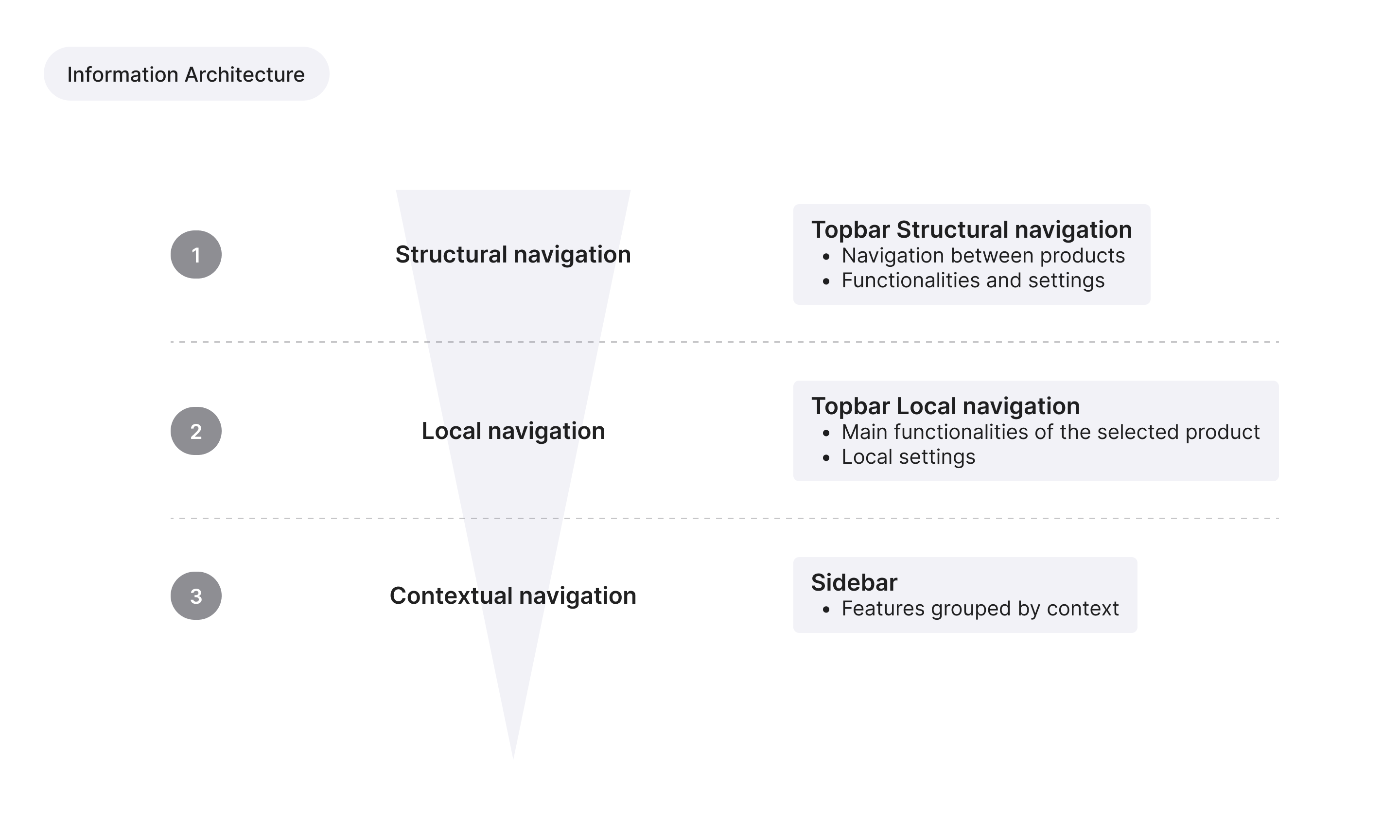
IA analysis — separating universal document access from department-specific intelligence tools
Within each layer, features were ordered by usage frequency — most-accessed at the top, progressively deeper as use decreases. This wasn't a categorization decision; it was a consistency rule applied across the entire navigation.
Key insight
Documents are the base of every user flow — universal access made sense as a shared layer
Intelligence tools only have value in the context of a specific operational routine — organizing them by department made that connection explicit
The two-layer structure allowed the navigation to scale: new documents go in the universal layer, new tools go where they belong operationally
Validating Before Building
Because the redesign introduced major structural changes, we validated the proposal through usability testing before implementation.
Working with limited time and budget, participants were recruited using product usage data in partnership with the Customer Success team. The study included both SMB and Enterprise users representing core usage patterns.
The prototype was built in Figma as a fully navigable experience. Instead of asking users to locate predefined features, tasks were framed around real goals:
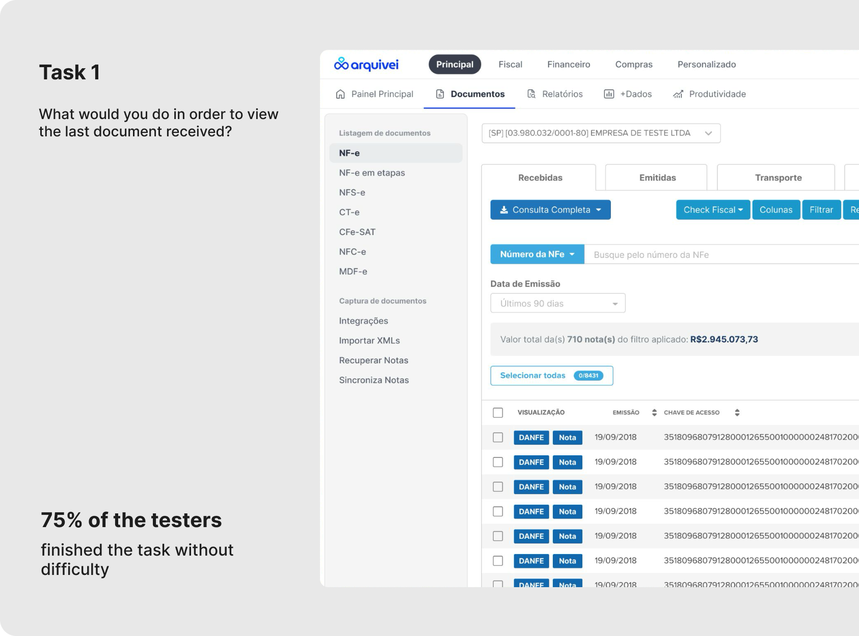
"What would you do to find the products you use most frequently?"
This helped uncover how users actually think about navigation, rather than measuring memorization.
Task 1 from the usability study — goal-framed to surface user mental models, not test recall
What testing revealed
The results were uneven — and that unevenness was informative.
75%
completed document-related tasks without difficulty — visuals and labels worked
62.5%
did not complete tasks involving features with more specific use cases
75%
could not locate account settings — the most difficult task in the study
The document layer held up — validating that the universal tab structure and labels resonated with users. The failures were concentrated in features with more specific use cases, where the 3-level depth created dead ends, and in account settings, which had no clear place in the proposed hierarchy.
From analysis to recommendations
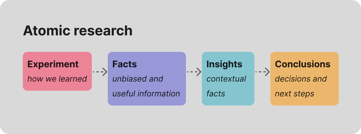
To analyze results, we used the Atomic Research methodology — moving from observations → facts → insights → recommendations. This prevented the team from reacting to isolated usability moments and created a defensible rationale for every design decision.
Atomic Research framework used to structure test analysis — observations → facts → insights → recommendations
The findings directly informed iterations: labels were rewritten using user language instead of product terminology, two navigation clusters were restructured, and navigation depth was reduced for high-frequency secondary tasks.
Key insight
Structural clarity is not enough if navigation depth creates friction
Testing early prevented flawed hierarchy decisions from reaching production
User language consistently outperformed internal product terminology
Final Solution
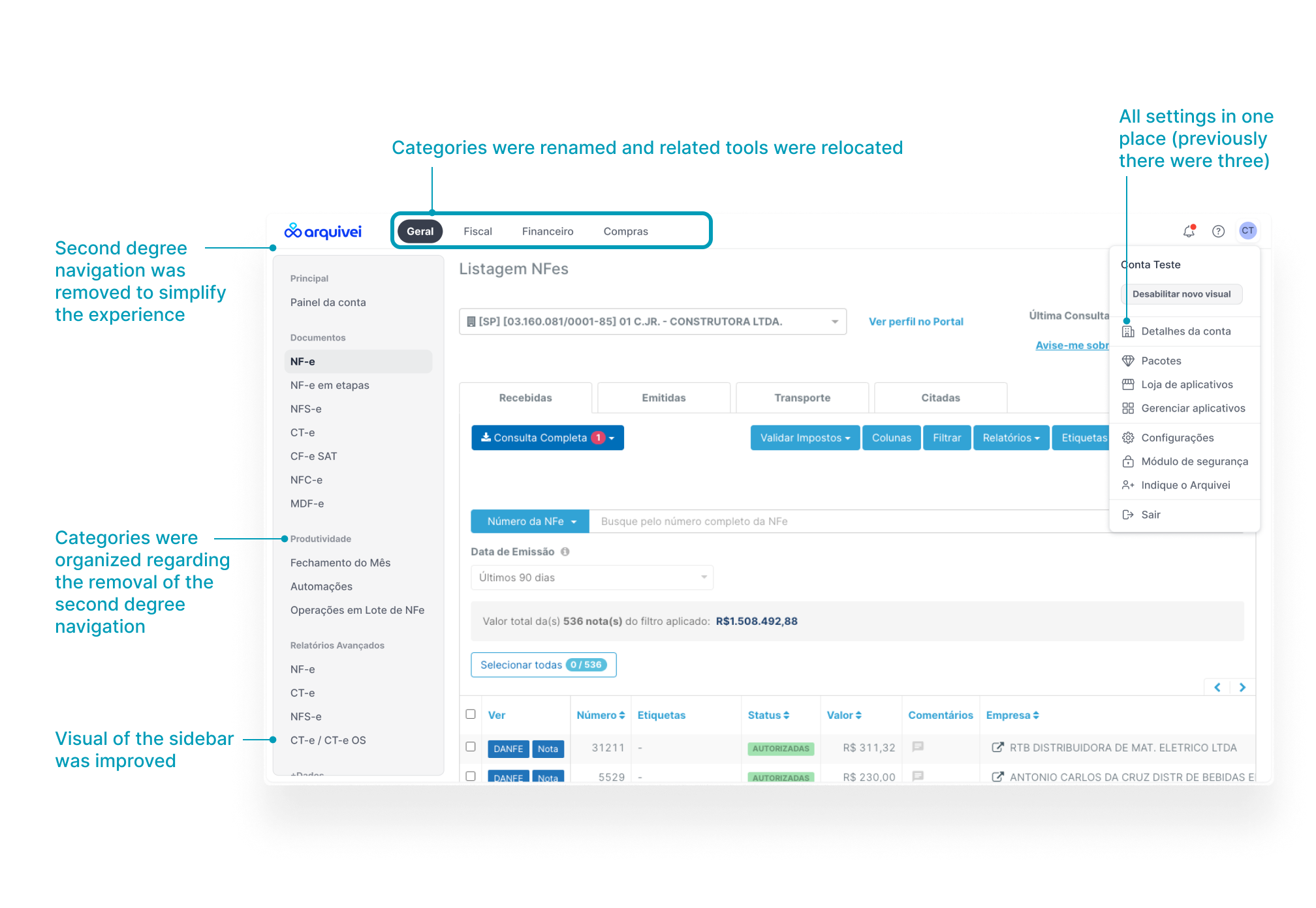
The new navigation system introduced
A more cohesive categorization framework
Reduced top-level clutter
Clearer entry points for new and experienced users
Improved mobile responsiveness
Scalable information architecture for future products
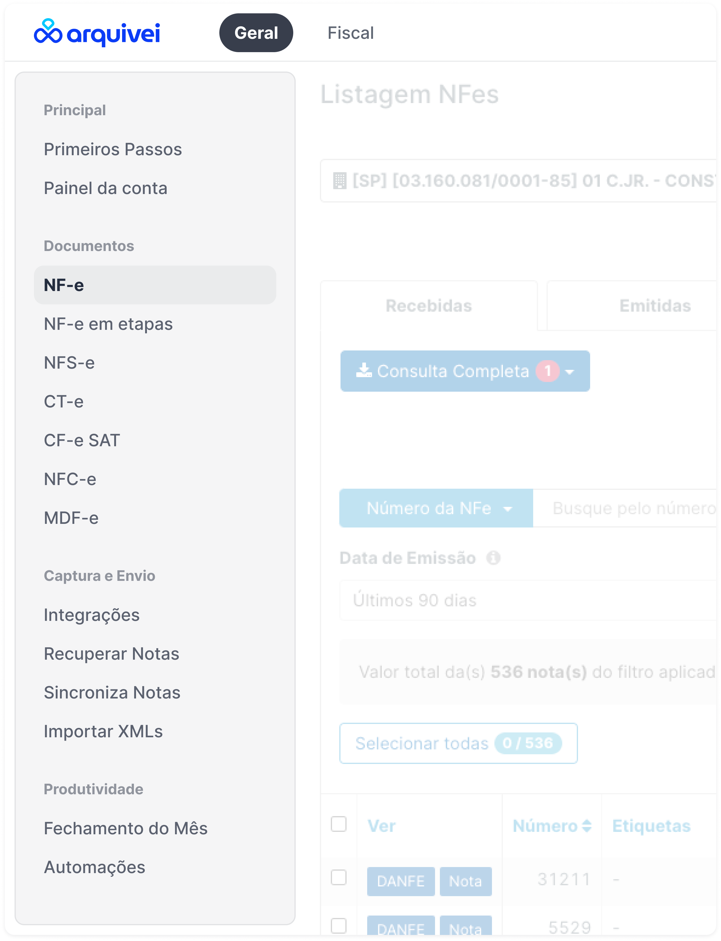
Final design — navigation reorganized around jobs-to-be-done, with document type as secondary layer
Design Handoff & Progressive Rollout
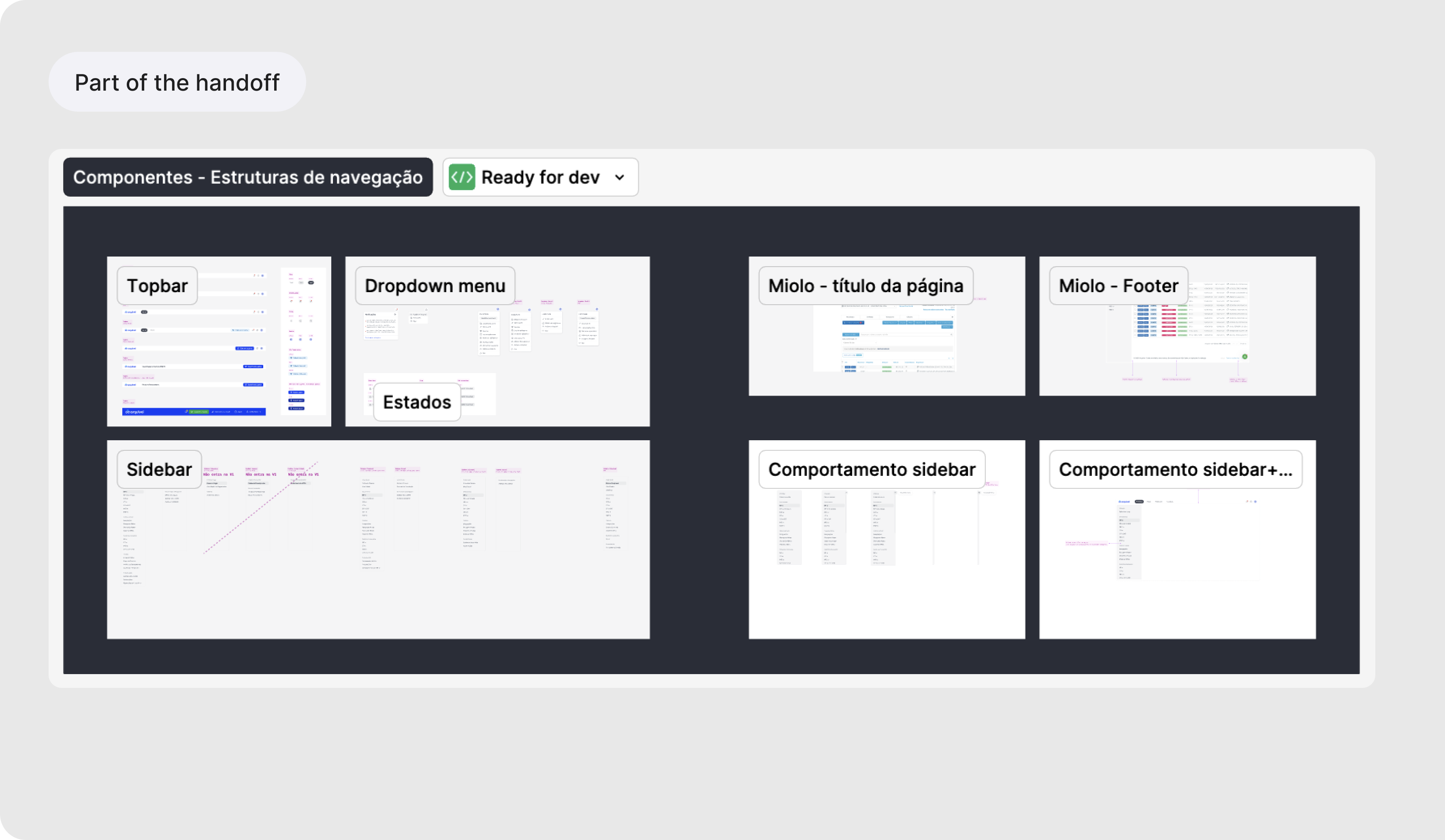
The rollout was implemented progressively — first released to 1,000 accounts with rollback access to the previous navigation, then adopted as the default structure for all new accounts. The categorization framework also became a reusable internal standard for future product additions, reducing ad-hoc information architecture decisions across teams.
Design handoff — progressive evolution strategy and component documentation
Key insight
Structural UX decisions can directly support long-term product scalability
Progressive rollout reduced organizational and technical risk
Navigation should evolve as a reusable system — not as isolated interface changes
Results
The usability study produced a structured report of insights and recommendations that directly drove interface changes — revised labels, restructured clusters, and reduced navigation depth on key flows
Task flows with 62.5%–75% failure rates were redesigned before development began, preventing those failure modes from reaching production
Today, the new navigation supports 15,000+ business customers and 60,000+ platform users
A later CSAT study showed 70.4% user satisfaction, validating improvements in navigation clarity and usability
The categorization framework was adopted as a reusable standard for placing new product features in the nav, reducing ad-hoc information architecture decisions going forward
Reflection
The hardest part of this project was not designing the interface — it was building alignment around structural change.
Making the case required reframing the problem in terms of scalability, feature discoverability, product expansion, and operational efficiency — rather than discussing it purely as a UX issue.
Takeaways
Validate structural decisions early with users
Navigation systems should scale with product growth, not react to it
Information architecture is as much an organizational problem as a UX problem
Page loading is part of the navigation experience — and should be defined as a design requirement, not a post-launch concern
Strong research synthesis creates better alignment across product and engineering teams
One lesson that only became visible after launch: the new navigation relied on a technology update that made the platform more robust, but the additional layers introduced longer page render times. More time to render meant a worse experience than before — even if the structure itself was better. It was a reminder that performance is not an engineering concern separate from UX. It's part of the experience definition, and it should be in scope from the beginning.